Visualizing Data
Overview
Teaching: 30 min
Exercises: 10 minQuestions
How can I create simple plots in Python?
How can I create multi-panel plots in Pyhton?
Objectives
Plot simple graphs from data.
Change some of the elements of a plot.
Visualizing data
The mathematician Richard Hamming once said, “The purpose of computing is insight, not numbers,” and
the best way to develop insight is often to visualize data. Visualization deserves an entire
lecture of its own, but we can explore a few features of Python’s matplotlib library here. While
there is no official plotting library, matplotlib is the de facto standard. First, we will
import the pyplot module from matplotlib and use two of its functions to create and display a
heat map of our data:
import matplotlib.pyplot
image = matplotlib.pyplot.imshow(data[:,1:])
matplotlib.pyplot.show()
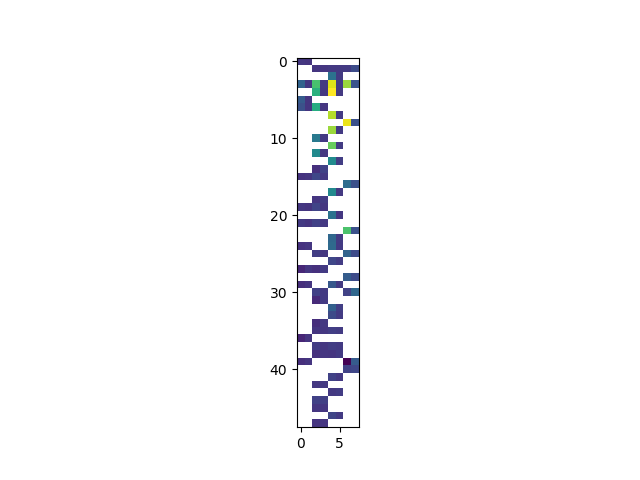
Blue pixels in this heat map represent low values, while yellow pixels represent high values. As we can see, flux rises and falls over a length of the observation period.
Some IPython Magic
If you’re using a Jupyter notebook, you’ll need to execute the following command in order for your matplotlib images to appear in the notebook when
show()is called:%matplotlib inlineThe
%indicates an IPython magic function - a function that is only valid within the notebook environment. Note that you only have to execute this function once per notebook.
Let’s take a look at the average flux over time:
ave_flux = numpy.nanmean(data[:,1:], axis=1)
mjd = data[:,0]
ave_plot = matplotlib.pyplot.plot(mjd, ave_flux)
matplotlib.pyplot.show()
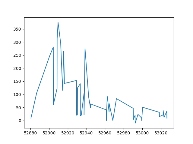
Here, we have put the average flux per day in the variable ave_flux and the Modified
Julian Date in the variable ‘mjd’. Then we
asked matplotlib.pyplot to create and display a line graph of those two variable. The result is a
fast rise and slow fall but it is very jagged. Let’s have a look at two other statistics:
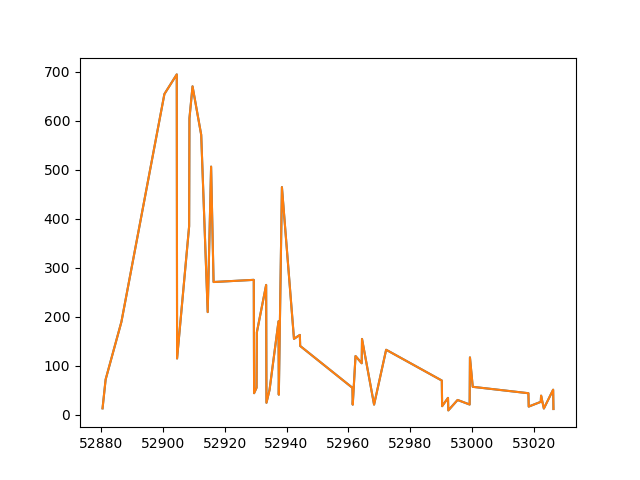
max_plot = matplotlib.pyplot.plot(mjd, numpy.nanmax(data[:,1:], axis=1))
matplotlib.pyplot.show()
min_plot = matplotlib.pyplot.plot(mjd,numpy.nanmin(data[:,1:], axis=1))
matplotlib.pyplot.show()
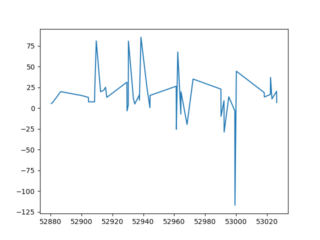
The maximum value rises and falls, while the minimum seems to be pretty flat. Of course, here we are averaging over several different bands and observations are only available for a subset of the bands for each date. It would be much better to look at the individual lightcurves for each band.
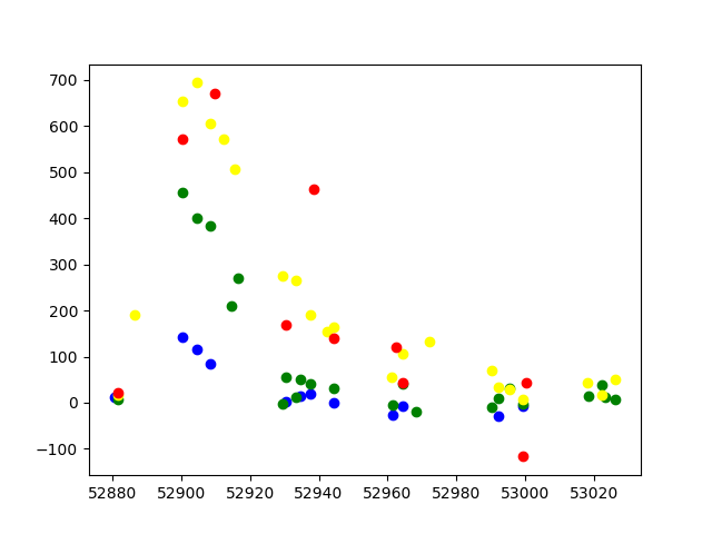
matplotlib.pyplot.plot(mjd,data[:,1],'o', color='blue')
matplotlib.pyplot.plot(mjd,data[:,3],'o', color='green')
matplotlib.pyplot.plot(mjd,data[:,5],'o', color='yellow')
matplotlib.pyplot.plot(mjd,data[:,7],'o', color='red')
matplotlib.pyplot.show()
Grouping plots
You can group similar plots in a single figure using subplots.
This script below uses a number of new commands. The function matplotlib.pyplot.figure()
creates a space into which we will place all of our plots. The parameter figsize
tells Python how big to make this space. Each subplot is placed into the figure using
its add_subplot method. The add_subplot method takes 3
parameters. The first denotes how many total rows of subplots there are, the second parameter
refers to the total number of subplot columns, and the final parameter denotes which subplot
your variable is referencing (left-to-right, top-to-bottom). Each subplot is stored in a
different variable (axes1, axes2, axes3). Once a subplot is created, the axes can
be titled using the set_xlabel() command (or set_ylabel()).
Here are our three plots side by side:
import numpy as np
import matplotlib.pyplot as plt

data = np.loadtxt(fname='data/03D1ar.csv', delimiter=',', skiprows=1)
mjd = data[:,0]

fig = plt.figure(figsize=(15.0, 4.0))

axes1 = fig.add_subplot(1, 4, 1)
axes2 = fig.add_subplot(1, 4, 2)
axes3 = fig.add_subplot(1, 4, 3)
axes4 = fig.add_subplot(1, 4, 4)

axes1.set_xlabel('MJD')
axes1.set_ylabel('g')
axes1.set_ylim([-150,720])
axes1.plot(mjd,data[:,1],'o', color='blue')

axes2.set_xlabel('MJD')
axes2.set_ylabel('r')
axes2.set_ylim([-150,720])
axes2.plot(mjd,data[:,3],'o', color='green')

axes3.set_xlabel('MJD')
axes3.set_ylabel('i')
axes3.set_ylim([-150,720])
axes3.plot(mjd,data[:,5],'o', color='yellow')

axes4.set_xlabel('MJD')
axes4.set_ylabel('z')
axes4.set_ylim([-150,720])
axes4.plot(mjd, data[:,7],'o', color='red')

fig.tight_layout()

plt.show(block=False)
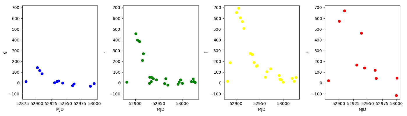
The call to loadtxt reads our data,
and the rest of the program tells the plotting library
how large we want the figure to be,
that we’re creating three subplots,
what to draw for each one,
and that we want a tight layout.
(If we leave out that call to fig.tight_layout(),
the graphs will actually be squeezed together more closely.)
Key Points
Use the
pyplotlibrary frommatplotlibfor creating simple visualizations.